Data is boring, information is interesting! I’ve always used this statement whenever the issue of data is being discussed. No one is really interested in looking at a large number of data rows, or even a small one. As humans, we tend to better understand a particular issue when it is presented to us in a visual way, and in this roundup you will find 20 sites using data visualization that deliver information to the user in an effective and inspiring way.
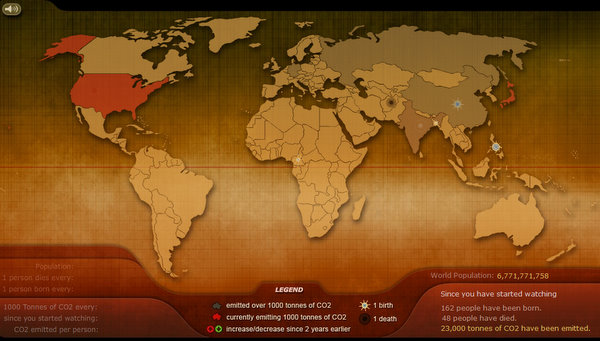
1. BreathingEarth.net
A real-time simulation displaying the CO2 emissions, birth and death rates of every country.
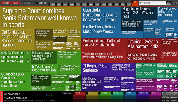
2. NewsMap.jp
A web application that visually reflects the constantly changing landscape of Google News.
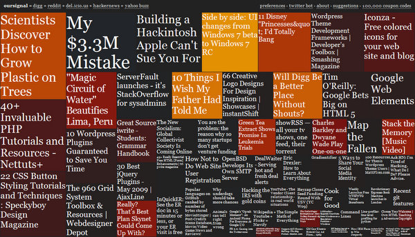
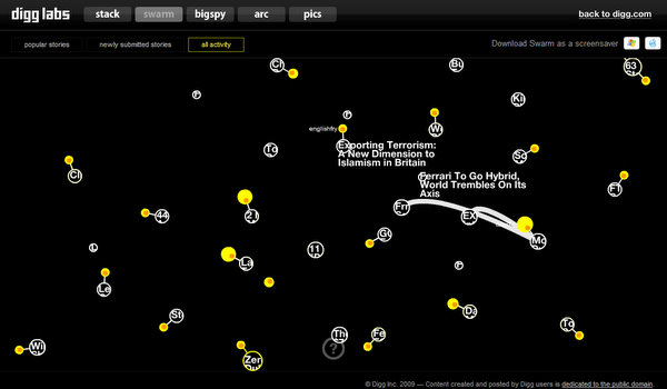
4. OurSignal.com
An overview of currently popular items on social news sites such as delicious, reddit, and digg.
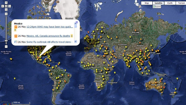
7. HealthMap.org
A visualization of the current global state of infectious diseases and their effect on health.
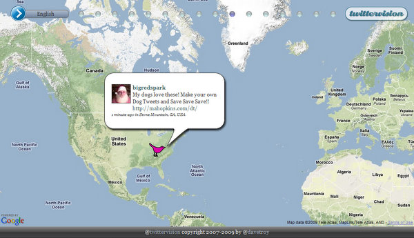
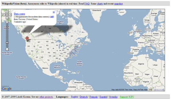
9. TwitterVision.com
A real-time geographic visualization of posts to Twitter. Make sure to check the 3D version.
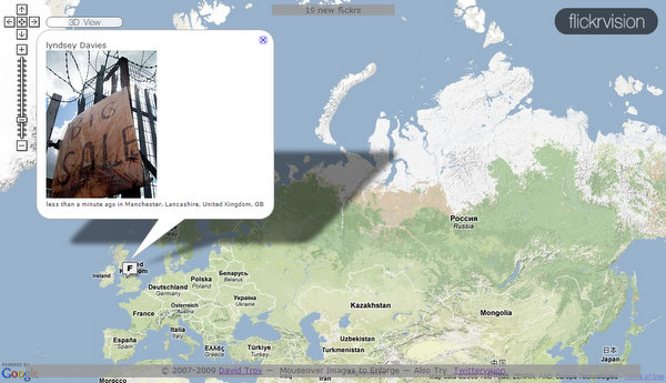
10. FlickrVision.com
Maps live traffic to Flickr. Similar to TwitterVision, the visualization can be viewed in 3D.
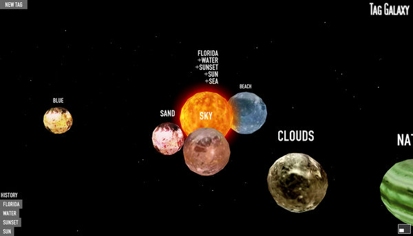
11. TagGalaxy.com
A planetary visualization of Flickr tags. Photos are displayed on a 3D globe by clicking the sun.
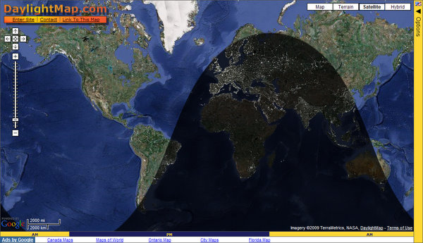
12. DaylightMap.com
Shows the pattern of night and day with many options such as a near real-time cloud cover.
Related Roundups
- 15 Hand Picked Color Palette and Color Scheme Generators
- 6+ Visual Bookmarking Sites – Online Bookmarks a la Speed Dial
- 15 Online Background Generators
- Top 7 Icon Search Engines
Helpful Articles and Resources
- Data visualization – From Wikipedia
- 175+ Data and Information Visualization Examples and Resources – by Meryl.net
- Data Visualization: Modern Approaches – by Smashing Magazine
- 16 Awesome Data Visualization Tools – by Mashable
Know Some More?
You know the drill; share them with everyone by adding them in the comments.


52 Comments
Posts about Mashable as of May 29, 2009 » The Daily Parr
May 29th, 2009 at 6:37 am
[…] beta invites from Mashable last night. And here comes my little write up of what you can expect 20 Inspiring Uses of Data Visualization – singlefunction.com 05/29/2009 Data is boring, information is interesting! I’ve always used this […]
Brad C
May 29th, 2009 at 7:40 am
Ow wow, these are very cool. I’ve never seen some of those twitter visualizations before. Thanks for rounding all these up for this post.
CSS Brigit | 20 Inspiring Uses of Data Visualization
May 29th, 2009 at 11:38 am
20 Inspiring Uses of Data Visualization…
Data is boring, information is interesting! A roundup of 20 sites using data visualization that deliver information to the user in an effective and inspiring way.
…
Webmasterish
May 29th, 2009 at 6:45 pm
Thanks for the feedback Brad!
m.dot
May 29th, 2009 at 10:49 pm
I called your post, a Data Orgasm on Twitter.
Thank you for this.
~m.dot
links for 2009-05-29 « Mandarine
May 29th, 2009 at 11:09 pm
[…] 20 Inspiring Uses of Data Visualization | SingleFunction (tags: visualization information inspiration) […]
seraphyn's status on Saturday, 30-May-09 08:04:35 UTC - Identi.ca
May 30th, 2009 at 3:04 am
[…] http://singlefunction.com/20-inspiring-uses-of-data-visualization/ Visualisierung von Daten, gute Beispiele […]
Sue
May 30th, 2009 at 1:26 pm
Wow, great round up!!!!
Thank you.
unregistered
May 30th, 2009 at 3:49 pm
Sorry, but none of the above holds to the standards of infographics.
All of them look nice at first glance, but you have to digg for the message. Some of them remind me of steganoinfographics.
Have a look at Edward Tufte or all the others….
links for 2009-05-30 « doug – off the record
May 31st, 2009 at 12:05 am
[…] May 30, 2009Google Wave: A Complete Guide May 30, 2009Sourcetone Interactive Radio May 30, 200920 Inspiring Uses of Data Visualization | SingleFunction May 30, 2009Spymaster — For your eyes only. May 30, 2009Coding a Clean Web 2.0 Style Web Design […]
aline
May 31st, 2009 at 2:47 pm
Awesome !!!!
You make it really easy for us to view all the good sites, its a pleasure looking into your round ups!
thx.:)
art2code
May 31st, 2009 at 4:59 pm
Nice list!
Thank you
George
May 31st, 2009 at 6:02 pm
I LOVE IT!!!
Thank you
POS
May 31st, 2009 at 8:52 pm
Very nice, thank you. I think the next step for the internet is to be able to organize massive amounts of information and turning it into something usable like the above sites.
Wasim
June 1st, 2009 at 1:44 am
Hi – These are terrific – here’s an interactive visualization of data breach incidents around the world http://www.voltage.com/solutions/data-breach – data supplied by datalossdb.org – part of the open Security Foundation
Daily Tech Links - June 2, 2009 - Sanjeev Agarwal
June 2nd, 2009 at 4:34 am
[…] General – 20 Inspiring Uses of Data Visualization […]
chusty
June 2nd, 2009 at 5:08 am
Wow, great round up!!!!
Thank you.
Alberto Téllez
June 2nd, 2009 at 7:17 am
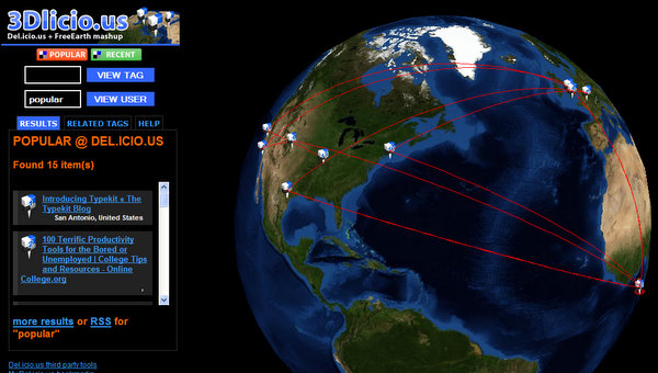
Thanx for including my Delicious Mashup (always beta).
It’s an honor to have it picked by your expert eyes 😉
Keep up the good work!
Regards,
Alberto
Webmasterish
June 2nd, 2009 at 1:08 pm
Thanks for the feedback everyone!
@m.dot Coolest tweet I’ve heard!
@Alberto Glad you dropped by!
justbecos I like them: issue #2 » justbecos.com
June 4th, 2009 at 1:15 am
[…] 6. 20 Inspiring Uses of Data Visualization. great use of visuals to show data results and concepts. http://singlefunction.com/20-inspiring-uses-of-data-visualization/ […]
20 Beispiele für Datenvisualisierungen in Websiten - blog.infografiker.com
June 4th, 2009 at 6:36 am
[…] singlefunction.com […]
Mel Ich
June 4th, 2009 at 7:38 am
Maybe that´s interesting too
http://visualizinglastfm.de/
Haftanın Derlemesi - 27 | Tasarımcının El Çantası | Hasan Yalçın
June 5th, 2009 at 3:51 am
[…] görselleştirmesine 20 nefis […]
web design
June 6th, 2009 at 4:08 pm
Very nice collection of web designs.
Creattica Community Linkup - June 2009 - Creattica Daily
June 10th, 2009 at 10:03 am
[…] 20 Inspiring Uses of Data Visualization […]
tibipop
July 3rd, 2009 at 11:21 am
Wow, great!!!!
Thank you.
interesting map USA, the geography of jobs
http://tipstrategies.com/posts/notebook/
Calgary Graphic Design
July 6th, 2009 at 1:21 am
Great collection. Particularly like the Twitter visualization. Too cool!
Linkliste für den Infografik Part « septemberupgrade
October 5th, 2009 at 11:37 am
[…] 20 Möglichkeiten der Datenvisualisierung http://singlefunction.com/20-inspiring-uses-of-data-visualization/ […]
Thomas
November 9th, 2009 at 3:53 pm
Amazing list. Thanks.
Data is Boring. Information is Interesting. Visualization Techniques | Creatalytics by Matthew Burgess
April 20th, 2010 at 1:24 pm
[…] From SingleFunction.com comes 20 Inspiring Uses of Data Visualization. […]
20 Inspiring Uses of Data Visualization | VizWorld.com
April 20th, 2010 at 2:36 pm
[…] with Digg or Twitter data, and pretty much every entry in the list is an interactive website.via 20 Inspiring Uses of Data Visualization | SingleFunction. About the Author: Randall Hand Randall Hand is a visualization scientist working for a federal […]
Deutschland und die Welt: leben, sterben, verschmutzen! | Kommunikationsblog
June 30th, 2010 at 6:38 am
[…] bei den Simulationen von singlefunction.com ist, dass Deutschland bei beiden Daten-Visualisierungen relativ gut weg […]
sagnelson
July 28th, 2010 at 10:33 am
My Gosh. How pointless and navel gazing are most of these? Does social media add anything but noise to life?
Kirsty
October 6th, 2010 at 4:24 am
Another cool use of dataviz is in the political sphere – notably how Obama used data visualization to convince America that his campaign was worth supporting. You can see his visualization here: http://bimehq.com/data-visualization/win-political-debates-data-visualization/
Muqeet Soomro
November 24th, 2010 at 1:15 am
great data … I like it thanks
Trevor Caesar
December 5th, 2010 at 3:25 pm
Take a look at this time zone data. You’ll like it if you like this post. Cheers.
Hola Mundo! « LogoSphere
December 20th, 2010 at 7:00 pm
[…] Data Visualizations […]
fliesenaufkleber
March 29th, 2011 at 1:53 pm
great collection, inspired me! Nr. 11 is my favorite.
myleggings
May 9th, 2011 at 9:42 am
great post of cool visualizations! but… the healthmap scared me.
Jidoka Innovation AB » Hur kan man hitta bra tydlig värdefull information när vi producerar mer och mer innehåll
May 15th, 2011 at 10:30 am
[…] Gör data mer inforamtiv, ”infographics så att man kan förstå vad den betyder. exempel från NYT, där man skapat en hel avdelning som jobbar med detta. – Den här är tom interaktiv, så att man enkelt kan ändra filter för att snabbt förstå samband. – Eller Hans Roslings Gapminder fantastiska grafer med tidsaxel för effektfulla presentationer – oj eller 20 till verktyg som dessa […]
Sonnenschirm
June 3rd, 2011 at 1:25 pm
was really very interesting!
Hubschrauber
July 18th, 2011 at 1:15 pm
great collection of data visualization
Martin
September 22nd, 2011 at 4:07 am
Thanks for the great list. Here is one as well: World Time Zone Map on http://www.globaltiming.com. Thanks guys 🙂
Carbonfolie
October 7th, 2011 at 4:23 am
Good collection of vizualiziations.
I like Nr.1 the most. This looks amazing!
20 Inspiring Uses of Data Visualization « designlooksnice
November 3rd, 2011 at 5:04 am
[…] Click here Like this:LikeBe the first to like this post. […]
TECHY TEACHER – WHAT THE TECH? » Visual Bookmarking and Data
December 26th, 2011 at 8:19 pm
[…] Source: Single Function/ […]
TECHY TEACHER – WHAT THE TECH? » Infographics
January 31st, 2012 at 2:02 pm
[…] Source: Single Function […]
Tasarım Lazım | Grafik Tasarım, Tasarım Haberleri, Tasarım Dersleri, Photoshop Elementleri ve Blog
March 8th, 2012 at 5:48 pm
[…] görselleştirmesine 20 nefis […]
2 D &nbps; I n f o r m a t i o n G r a p h i c s | about gamers
March 31st, 2012 at 7:20 pm
[…] Design and Data Visualization Agency | PortfolioInfographic Design20 Inspiring Uses of Data Visualization | SingleFunctionGallery of Data Visualization – Historical Milestones25 Juicy Information Poster Design […]
20 Inspiring Uses of Data Visualization – http://singlefunction.com/20-inspiring-uses-of-data-visualization/ | Julien Ferla
April 12th, 2012 at 11:37 am
[…] singlefunction.com/20-inspiring-uses-of-data-visualization/ Tweet […]
Angela Smith
February 25th, 2013 at 2:49 pm
Hi,
Your website is just awesome.I loved it.Have a look at this website-http://ernestoolivares.com/tools-for-data-visualization/
Thanks.
z sieci, 2009-06-01 | Echo Sieci
September 12th, 2014 at 4:55 am
[…] http://singlefunction.com/20-inspiring-uses-of-data-visualization/ […]